A Game-Changing UX Makeover
B2C | E-commerce | Responsive • UX Research • Design Thinking • Visual Design

Picture this: A man stands in front of his mirror, box of hair dye in hand, wondering, "Is this the right shade or will I look like a carrot?"
He goes to the JFM website for answers, only to get lost in a maze of product pages, vague descriptions, and broken flows.

THE (HAIRY) PROBLEM
JFM users were dropping off, frustrated by confusing navigation, limited shade & product guidance.
That’s where we stepped in, armed with UX research, a keen eye for design, and an appreciation for well-groomed beards.
OVERVIEW OF THE PROBLEM
No personalization
Too many options, too little guidance
Lack of trust & confidence
Just For Men (JFM) offered a range of products in men grooming, but its consumers could not buy and use them efficiently. Users were unable to bridge the gap between their needs and finding the right product.
THE MAKEOVER PLAN
AI-powered virtual try on
Guided product finder
Educational platform
Unfolding The Designs


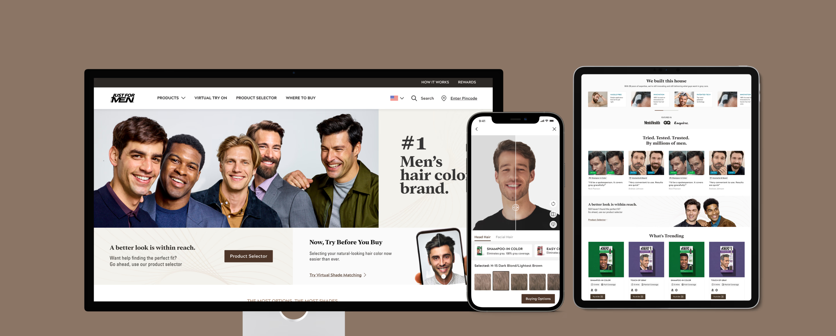
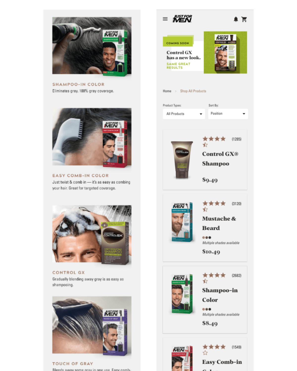
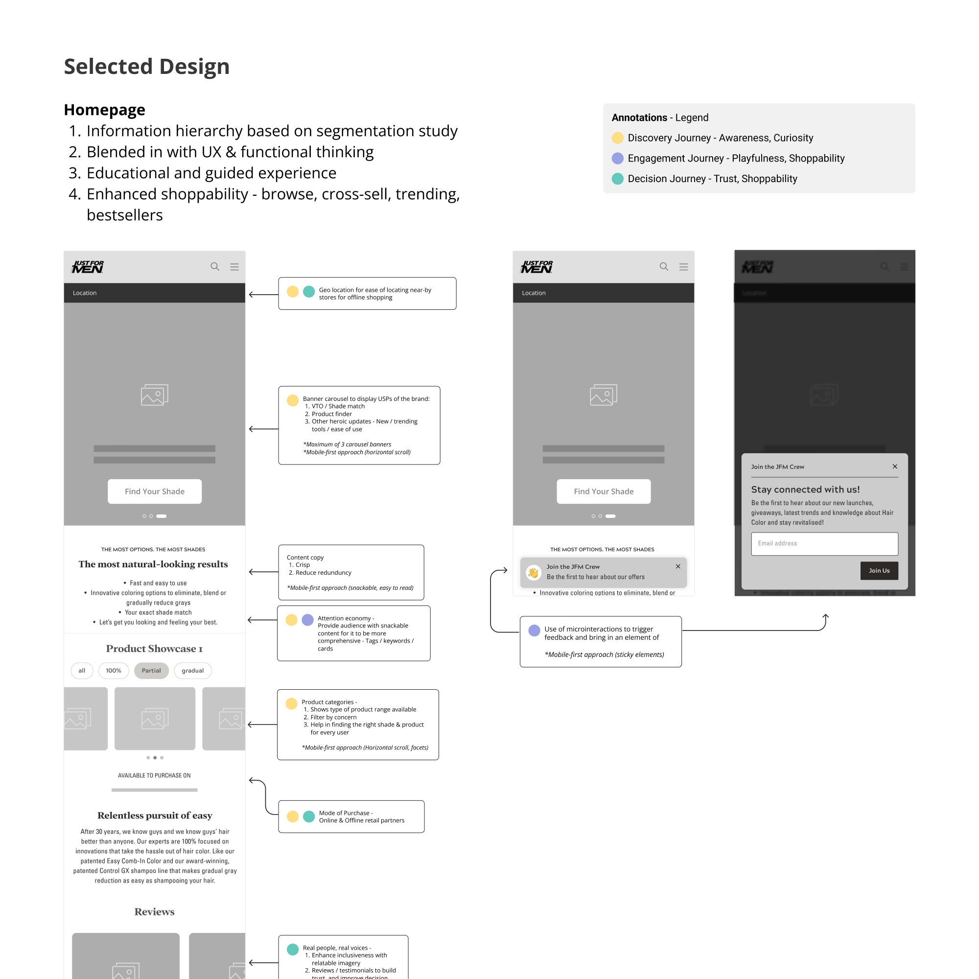
HOMEPAGE
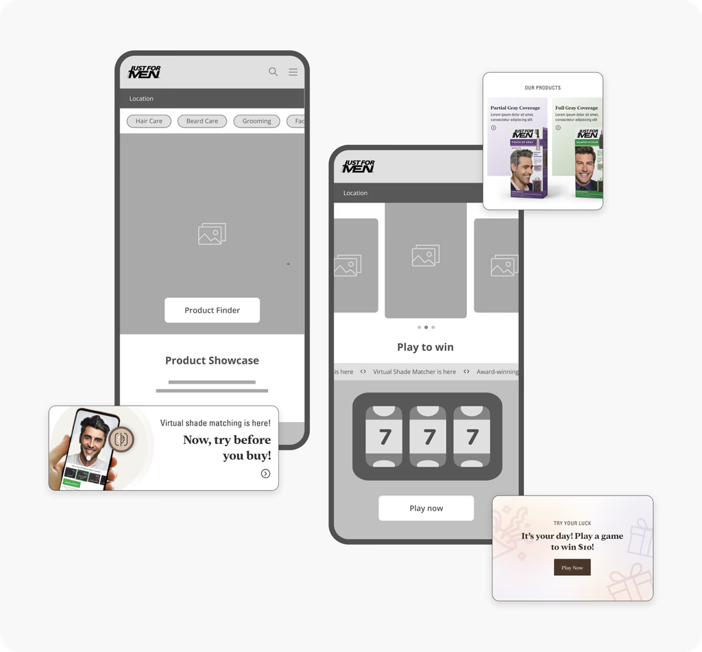
PRODUCT FINDER
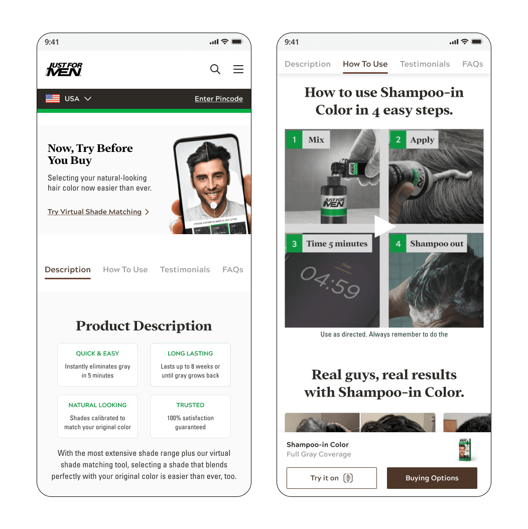
PRODUCT DESCRIPTION
Upload a selfie, try on shade options, proceed to buy.


Helping users find their perfect match, effortlessly. No more guessing!
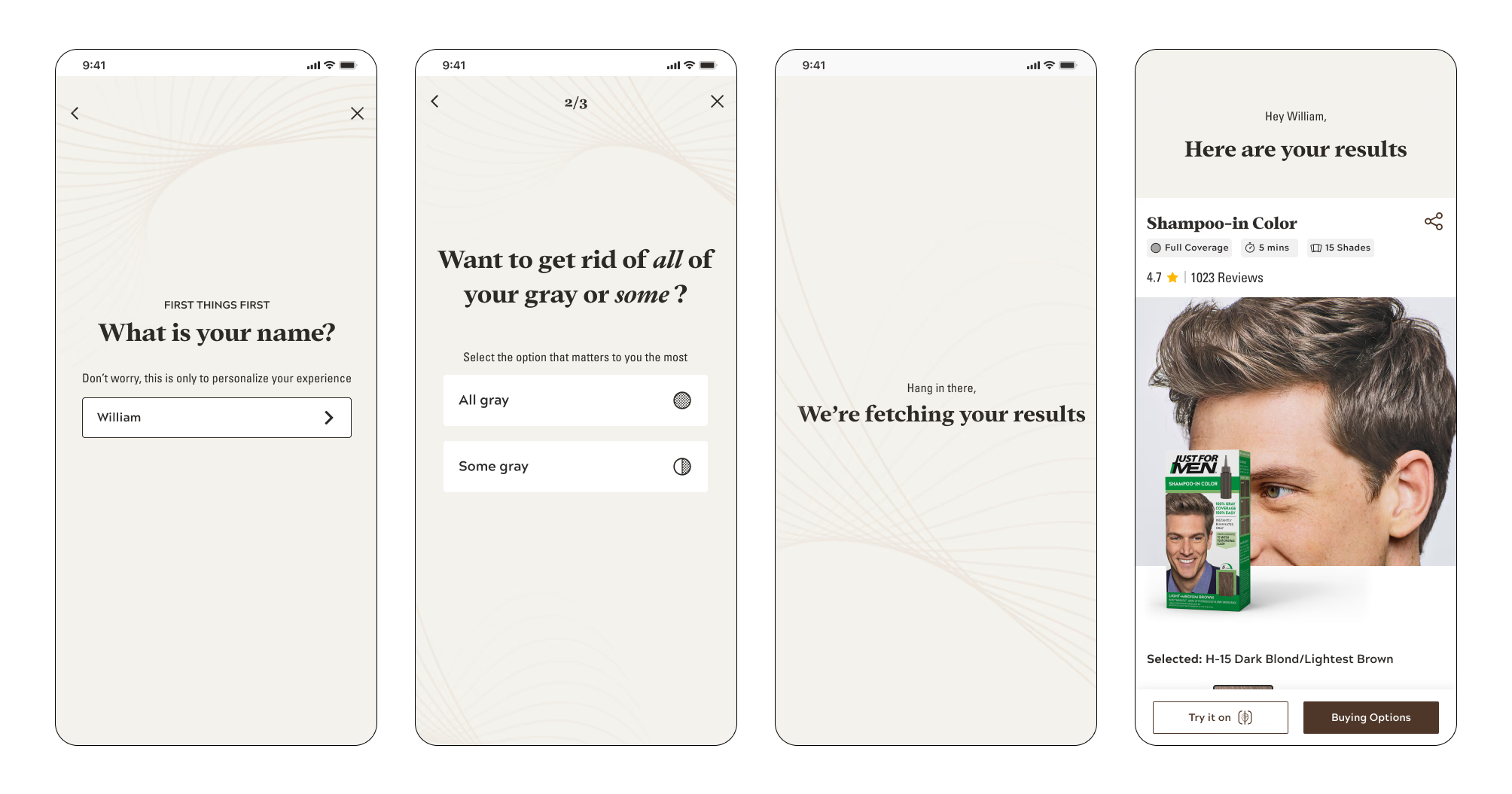


Guides users to their grooming needs, new products and personalized experience.


THE oUTCOME
40%
Increased organic growth
50%
Increase in per page view duration
10%
Reduction in bounce rates
Let's Deep Dive Into The UX Process
Team JFM aimed to shift from direct sales on their website to creating an educational platform that guides users in discovering the right products and perfect color shades based on their needs.
CONTEXT
JFM, a subsidiary of Combe, is America’s leading men’s hair color and grooming brand. Focused on men’s grooming needs, they offer a comprehensive range of hair and beard care products. Their solutions deliver natural-looking results, enhancing both appearance and confidence.
MY ROLE
• Design Lead & Individual Contributor
COLLABORATORS
• 2 UX Designers
• Product Managers
• Developers
PROBLEMS WITH OLDER VERSION
We conducted a thorough UX audit of the older version of the website to identify pain points and opportunities for improvement. Our audit included an analysis of site navigation, information architecture, user flows, and overall usability.

IDENTIFIED ISSUES
Outdated designs
Lack of product search
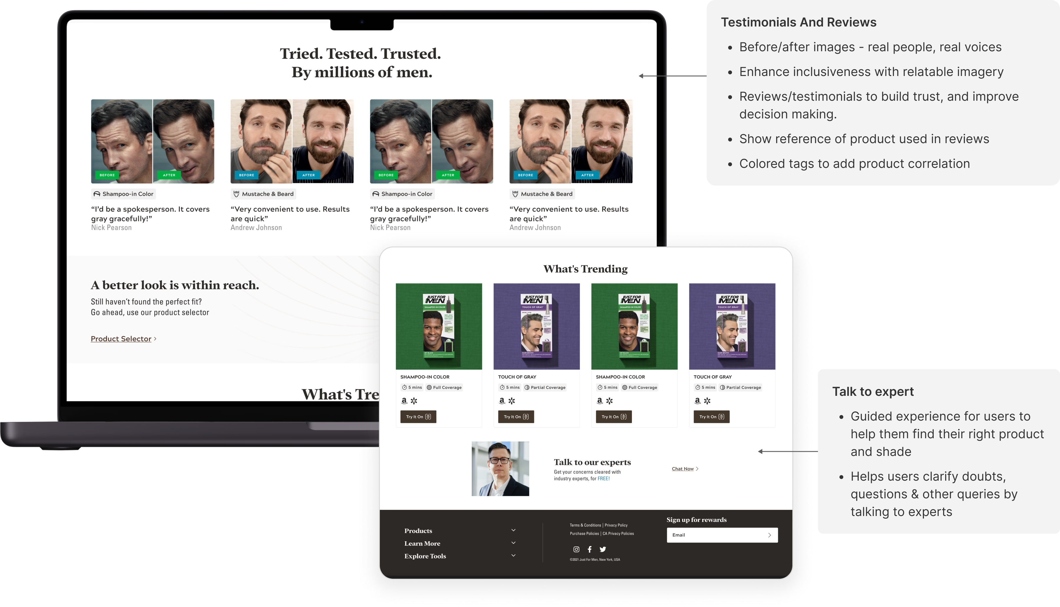
No reviews, real stories - lack of brand trust
Unclear product use and information
Poor navigations and CTAs
Unclear value propositions
No guided experience
UNDERSTANDING THE USERS
We collaborated with product managers, marketing, and sales teams to gather qualitative insights by conducting user interviews, reading customer reports, helping us understand user needs and perceptions of JFM products. After analyzing primary research, we conducted secondary research through online forums, reviews, and competitor analysis, leading to the creation of data-driven core personas that guided our design strategy.
TARGET AUDIENCE
Our primary focus was men aged between 35-60 who utilized the products for a variety of purposes including:
Enhancing their personality
Embodying confidence
Managing early graying
Maintaining a polished appearance


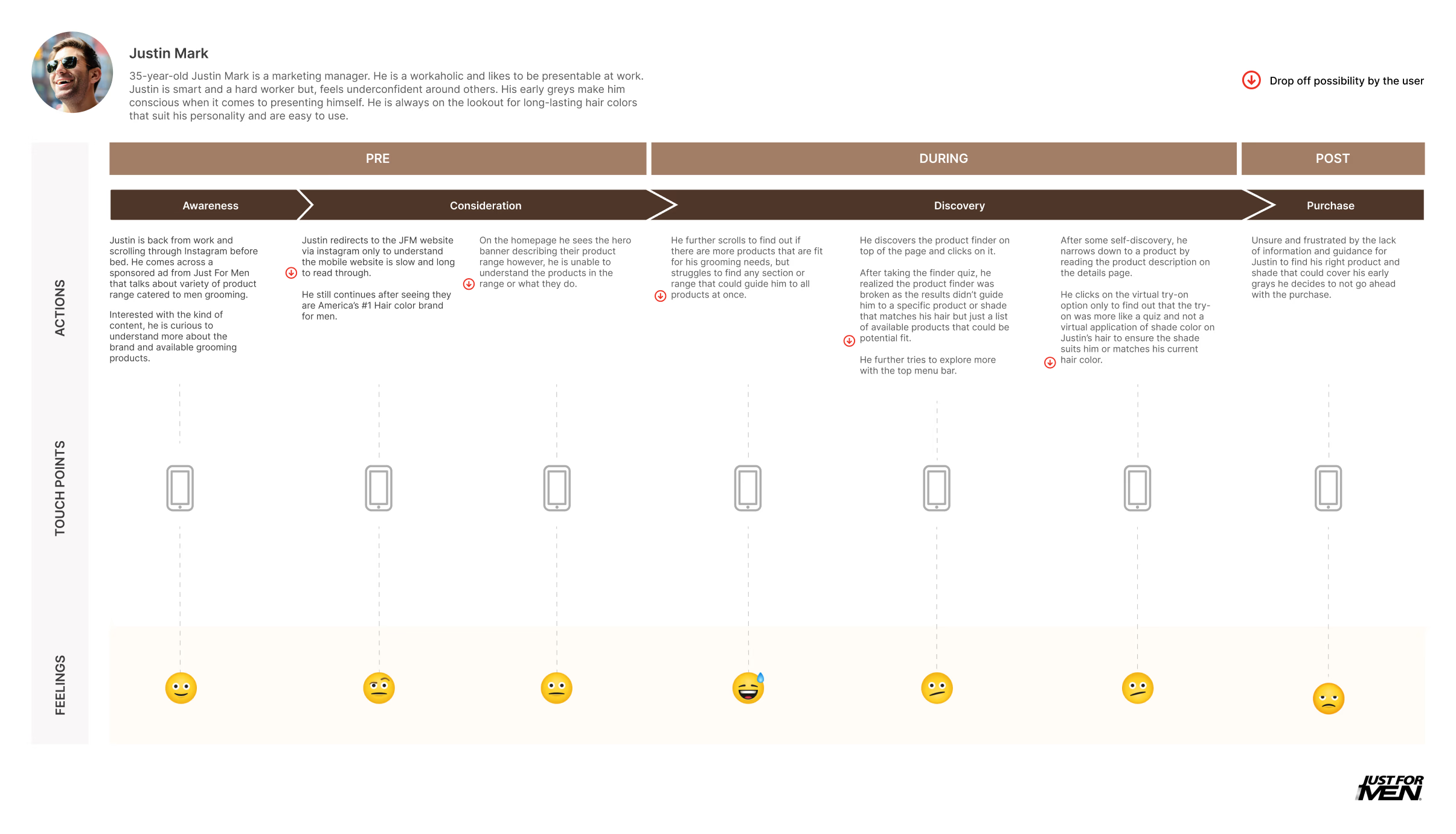
CURRENT STATE USER JOURNEY
Mapping the current state journey revealed the strengths and weaknesses of the process. It highlighted user interactions with the website and identified potential drop-off points caused by issues like-
Broken flows
Unclear CTAs
Poor product discoverability
Confusing navigation
Overwhelming content
Lack of mobile optimization
Ineffective search functionality
DESIGN THINKING WORKSHOP
Through our interactions with the JFM team, we identified gaps in perspectives that led to conflicts and uncertainty in the design process. To align viewpoints and define a clear MVP, we decided to conduct a design thinking workshop for the team.
My Role: Workshop Co-ordinator
Participants: 10
Backgrounds: Product manager, Marketing, Creative Director, Brand Managers, Content Writers, Designers

Activity 1: Feature Mapping
We gathered top features and functionalities for the new platform and, with the team, prioritized them into 'must-haves' and 'good-to-haves.' Each 'must-have' feature was then mapped to how a JFM user would interact with it throughout their journey.
Example, integrating Instagram videos from relevant hashtags helps build brand identity by connecting users with authentic reviews and relatable experiences.

Activity 2: Preference Mapping
Exploring trending visual styles used by competitors helped us define a cohesive design direction. The mapping process provided key insights into our visual goals, allowing the team to identify preferred UX elements, styles, and layouts to incorporate into the brand’s identity.
FROM THE RESEARCH & WORKSHOP: DEFINED GOALS & OBJECTIVES
Personalization
Curated for the user, an ability to recommend the right products, find and shop their needs
Retention & Acquisition
Persistent email captures on main pages by offering rewards, gifts, coupons, etc.
Mobile First Approach
Create a user-friendly, seamless on-the-go experience which proves as smart, efficient and intuitive experience by tapping into the digital behaviors/gestures like click, swipe, scroll, sticky banners, etc
Guided Experience
Ensure a simple experience which is educational yet engaging. Focus on decreasing bounce rates and improve product discoverability (bestsellers/category/recommended)
Tone Of Voice
Enhance brand credibility by sharing research/innovation/what we do etc. Inclusive design with relatable imagery, real testimonials, reviews.
ADDITIONAL INSIGHTS
Attention Economy
Gamify The Experience
Minimal And Trendy Look
EVALUATION OF WIREFRAMES
Structuring content effectively
Optimizing space utilization
Establishing a clear visual hierarchy
Ensuring seamless user flows and navigation
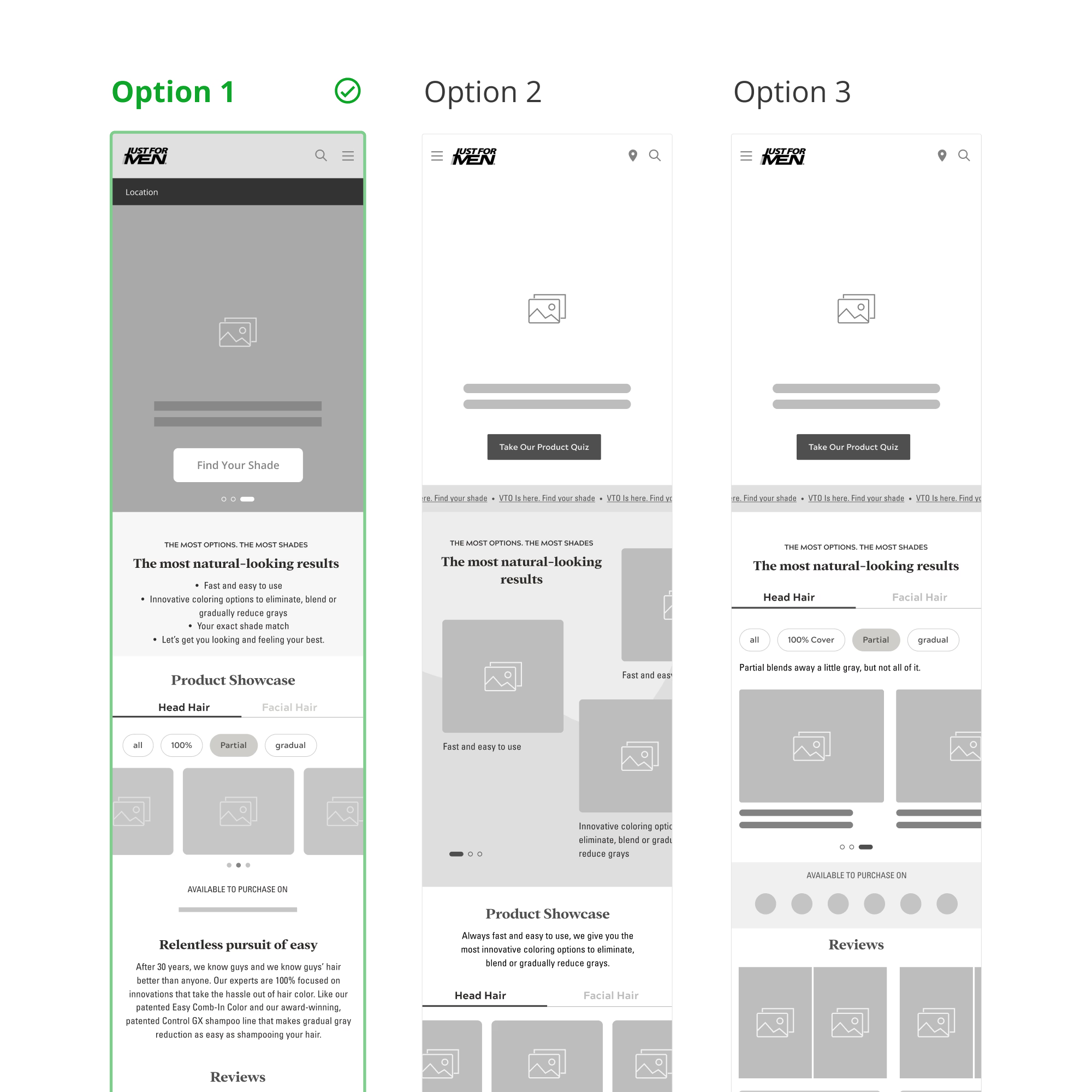
DESIGN ITERATIONS
After finalizing key flows in the wireframes, we defined the visual style, beginning with the homepage. We experimented with colors, imagery, and new component styles to create distinct sections and dynamic patterns.


GAPS IN OUR UNDERSTANDING
Following the workshop, we made certain assumptions that prompted us to overhaul the website entirely. This included altering accent colors, banner styles, and adding or removing content/sections as needed.
Based on our initial understanding, we created visuals but, after multiple discussions and feedback from the Just For Men team, we pivoted and started fresh to better align with their vision.
THE PIVOT
Retain Brand Identity
Maintain Content
& Structure
Old Design
New Design
PRODUCT LISTING
Old Design
New Design
PRODUCT DESCRIPTION
VISUALS/MOBILE EXPERIENCE

VISUALS/DESKTOP EXPERIENCE
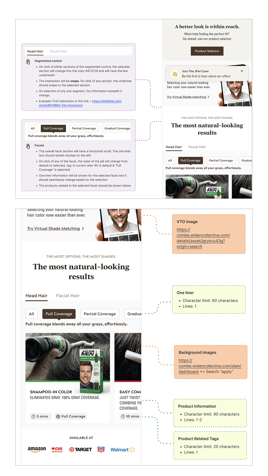
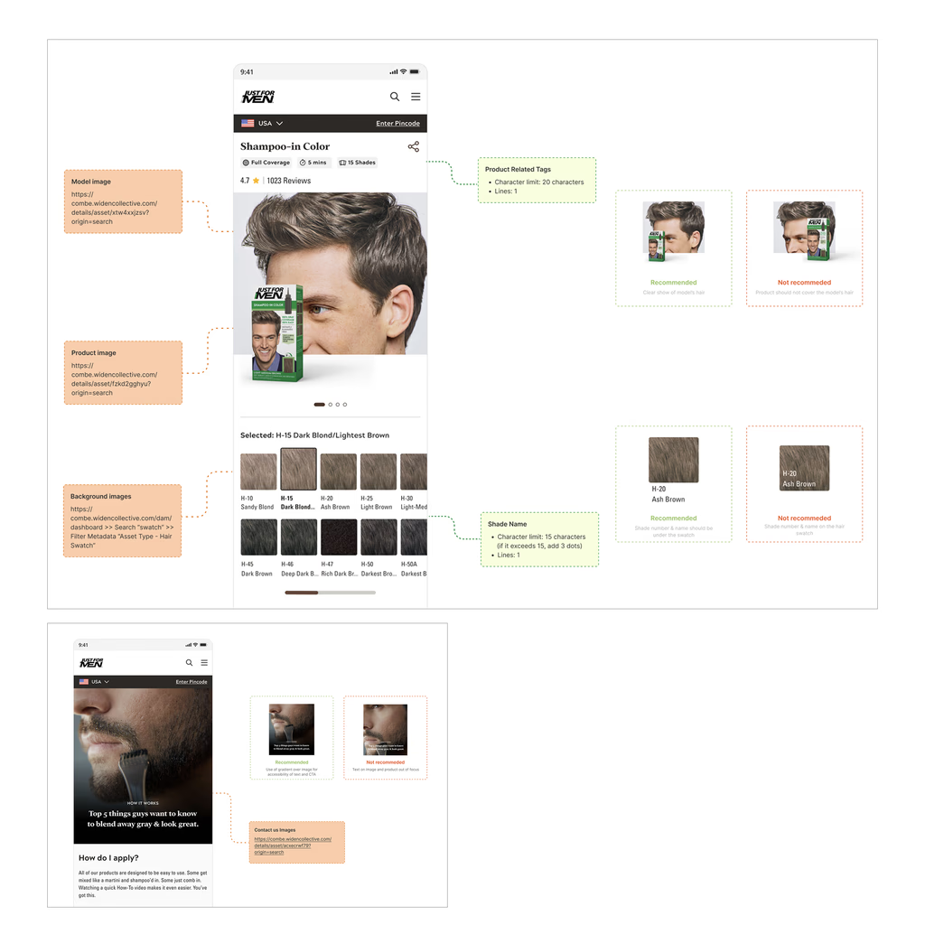
DEVELOPER HANDOFF
We conducted multiple detailed walkthroughs with the development team for handover of designs. A file with detailed annotations describing use of components, their alternatives, animations, dos and don'ts for use of type of imagery, icons, banners, etc. was created. This thorough handover process ensured clarity, consistency, and seamless implementation, enabling the development team to bring the designs to life with precision.
IMPACT
The website experienced an organic traffic growth of 40% over the span of one year, 80% of which comes from mobile. It also resulted in reduction of bounce rates by 10% improving the per page view duration by almost 50%.